Case Study
Everyside
In the heart of Toronto’s ever-evolving food and beverage scene, a new microbrewery was taking shape. Located on Adelaide Street, this venue wasn’t just another craft beer destination—it was a place that felt like home. A space where locals could gather, relax, and share a drink, surrounded by thoughtful, quality-driven offerings. With a founder deeply invested in community and authenticity, Everyside needed a brand that embodied these values while positioning the brewery for future growth and evolution.
-
Toronto, Ontario
-
DesignAgency
-
Art Direction
Brand Strategy
Brand Guide
Copy Writing
Creative Direction
Design Direction
Graphic Design
Logo Design
Merch
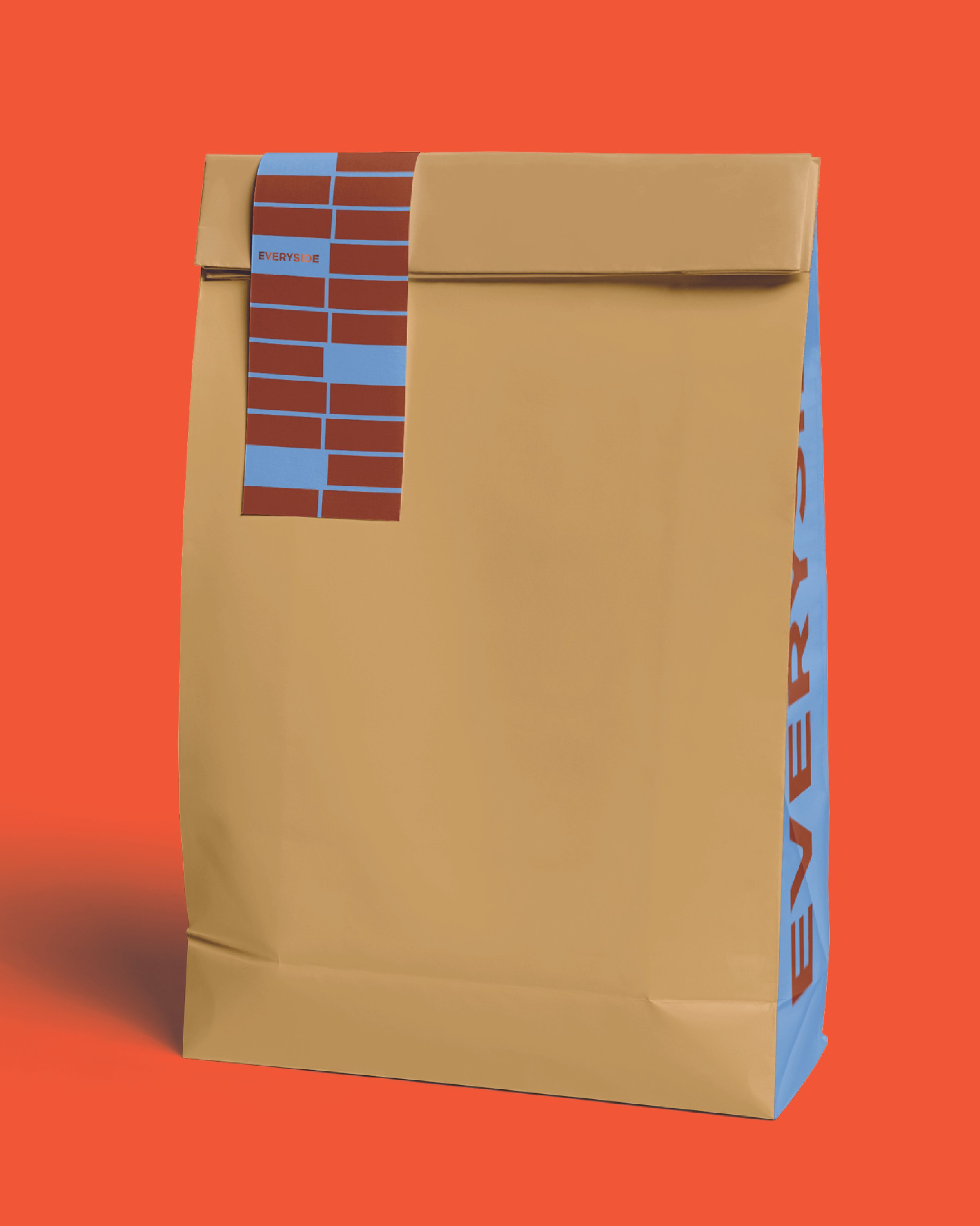
Packaging
Naming
Tagline
Visual Identity
Website


Dig
Deeper
-
Our challenge was clear: design a brand that felt both rooted and ready to scale. Everyside wasn’t just a brewery—it was a community hub that combined a taphouse, bottle shop, and educational component into one experience. The brand had to:
Embrace a casual yet sophisticated identity that could appeal to a broad demographic
Build a foundation that allowed for growth, from a signature beer collection to seasonal releases
Stand out in a competitive market without resorting to clichés or trend-chasing
The final brand captured the founder's vision and the community-driven essence of the target audience, while leaving room for future possibilities.
-
We began with a Strategic Development workshop, engaging with the founder and interior design team to dive into the vision for Everyside. What emerged was a desire to create something unique for the local community—an approachable, welcoming space that would offer more than just food and drinks, but a genuine sense of belonging. From there, we explored trends in the broader hospitality industry and dug into local dynamics, examining everything from global movements in sustainable brewing to the nuanced needs of the neighbourhood.
This research led us to four core themes:
Dreaming: A reference to the idea of relaxation and escape, inspired by the sculpture outside the brewery.
Place: Drawing from the local environment, the street, and the physical space itself.
Break: Celebrating the simple act of taking a break, whether during work or leisure.
Perspective: Inspired by the sculpture’s dynamic nature, representing Everyside as a place for all views and backgrounds.
With these themes, we set out to define a custom name and brand positioning that would resonate with the local community and visitors.
-
The team worked with Everyside through five critical phases, each building toward a cohesive and flexible brand system.
Phase 1: Strategic Development & Naming
We kicked off with a collaborative workshop to hone in on the key attributes of Everyside’s brand—exploring the founder’s vision, key strengths, and target audience. After generating a series of potential names, we landed on Everyside. This name carries dual meaning: a metaphor for perspective and a nod to inclusivity, uniting both neighbourhoods and people from all walks of life.Phase 2: Brand Positioning & Narrative
The brand positioning was shaped around the idea of Everyside being "your favourite local," a place where everyone feels at home. We crafted a concise brand narrative, articulating Everyside’s mission to create a welcoming space for locals to gather, share, and enjoy.Phase 3: Visual Identity & Creative Direction
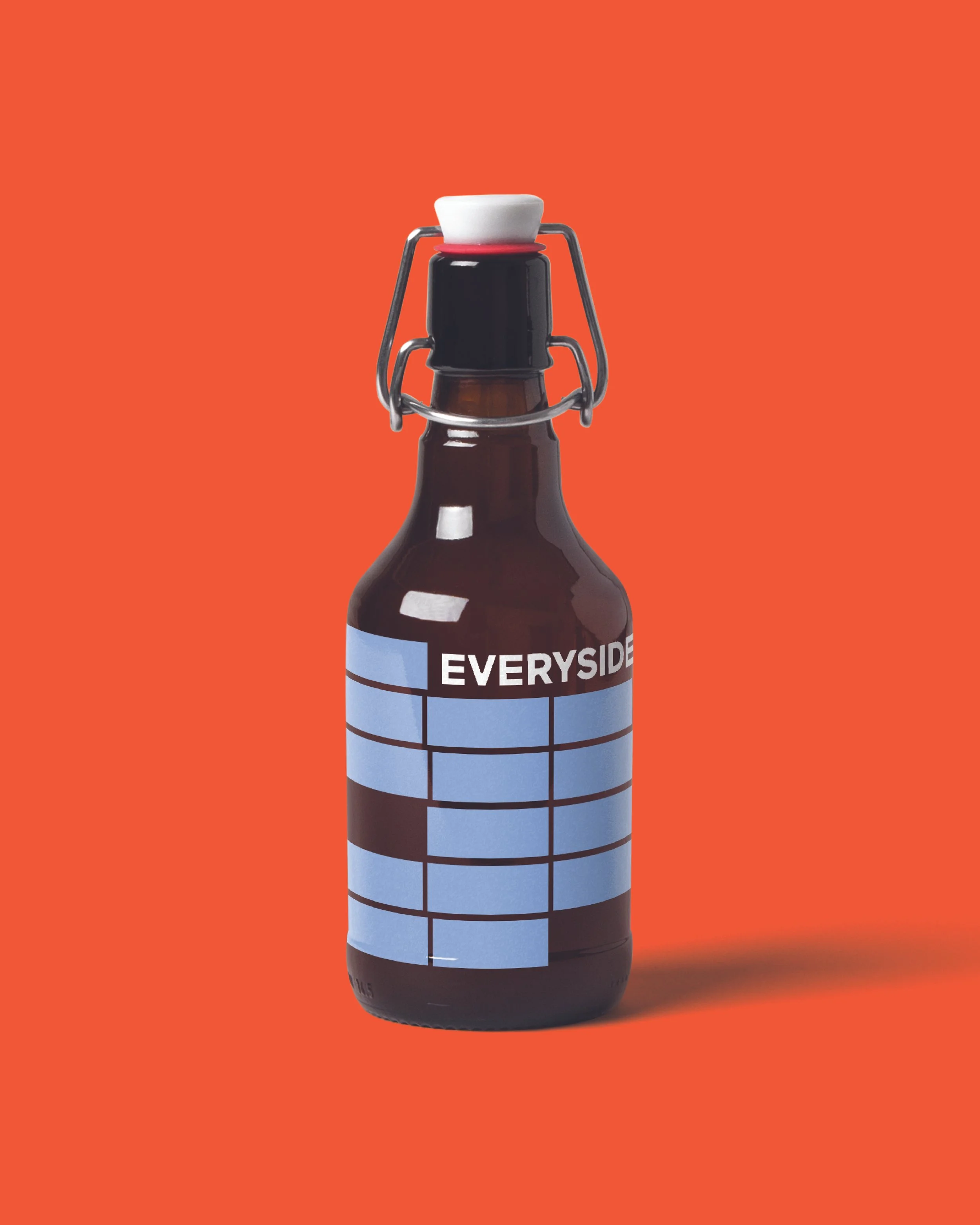
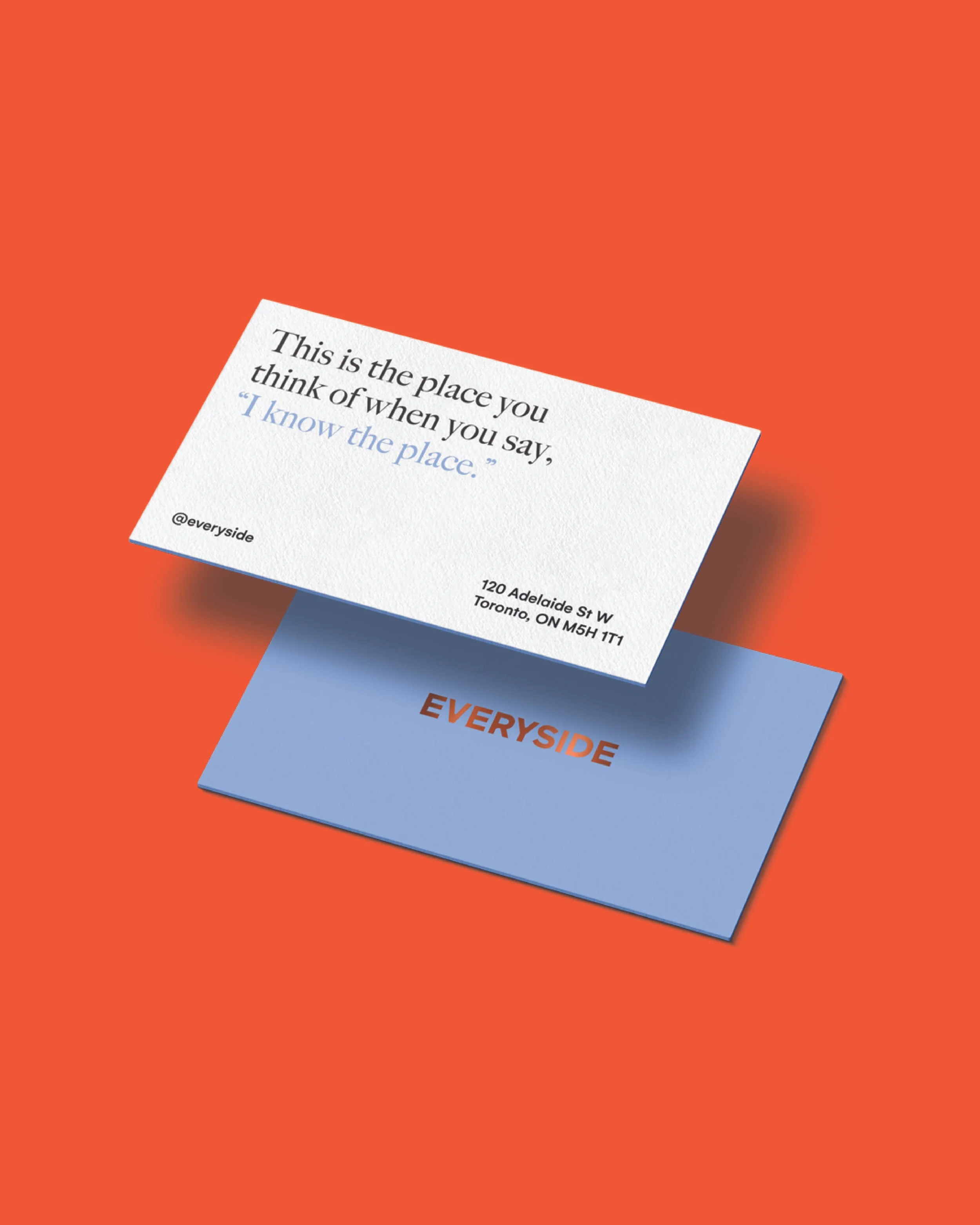
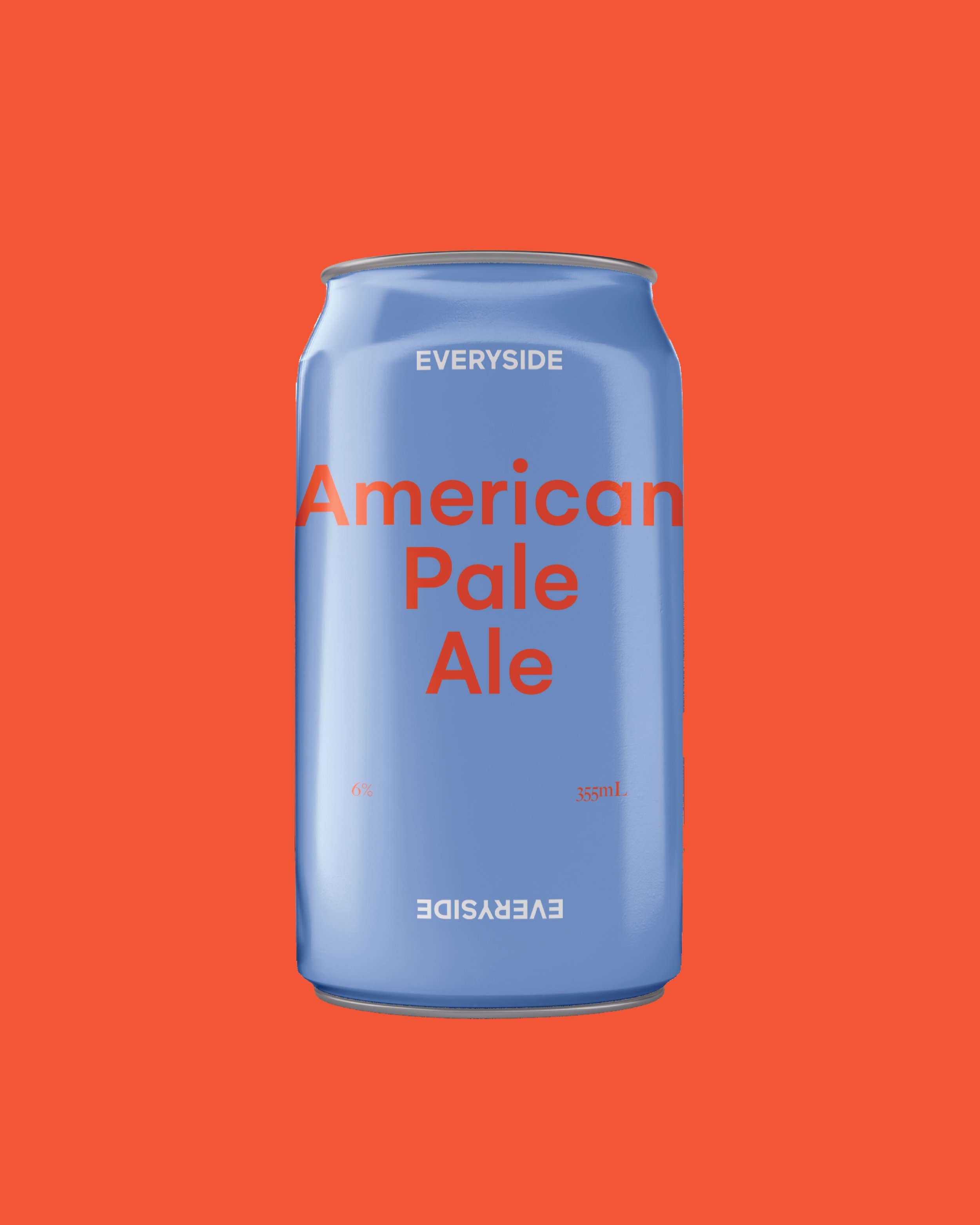
The visual identity evolved from a mix of modern sophistication and traditional craft aesthetics. Elements like copper foil and rich saddle brown tones were inspired by brewing equipment and vintage taverns, while vibrant colours like lavender and persimmon brought freshness and vitality. This balanced, modern approach was reflected in the logo, type system, and all visual elements.Phase 4: Brand Expression Across Touchpoints
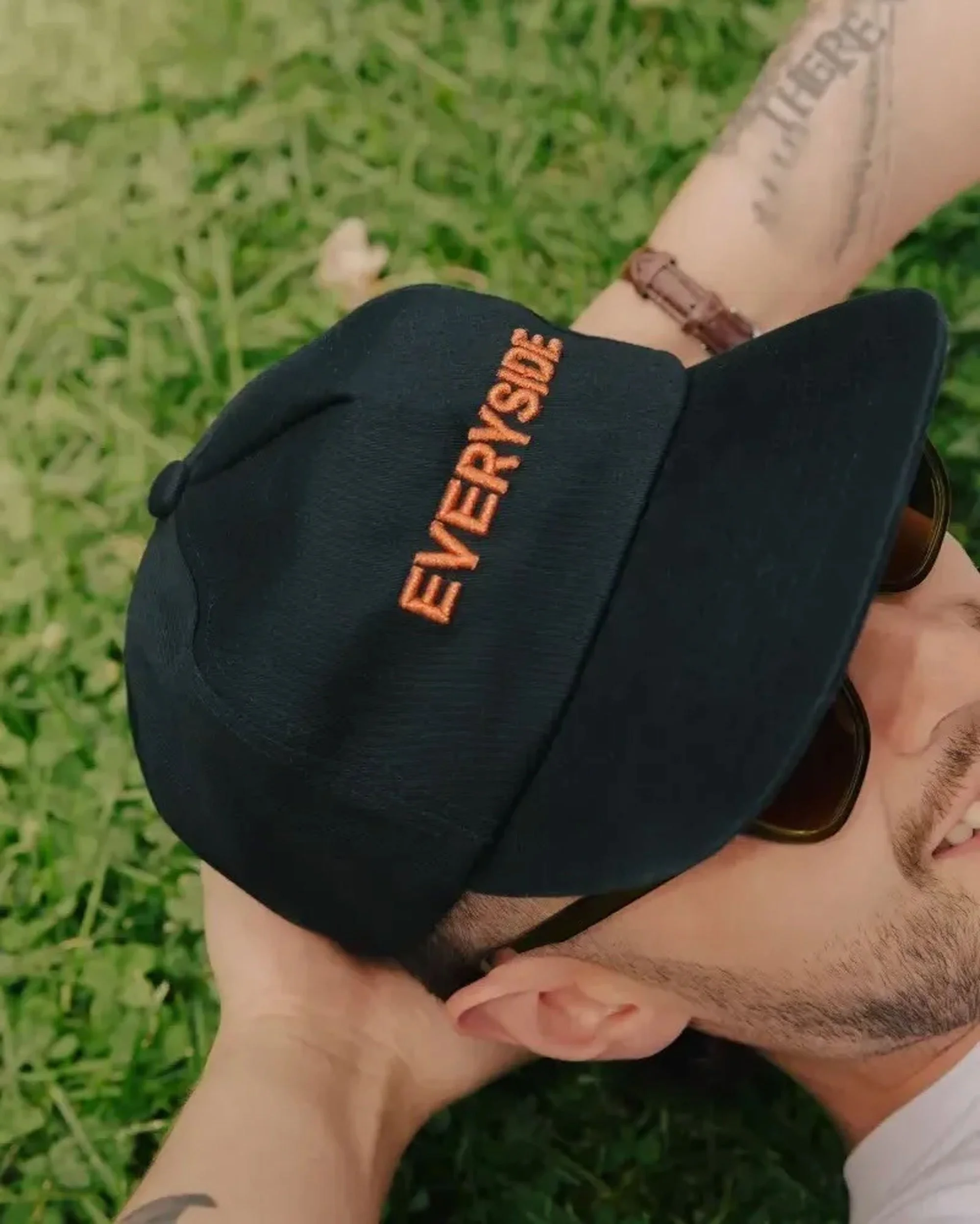
We translated the visual identity into all key brand touchpoints, from the brewery’s interior design to packaging and merchandise. Each detail was carefully considered to reflect Everyside’s welcoming, community-oriented vibe while staying true to the brand’s craft ethos.Phase 5: Implementation & Rollout
We supported Everyside through the application of the brand across both digital and physical platforms, ensuring consistency in tone, design, and customer experience. The result was a versatile toolkit that allowed Everyside to adapt as the business grows, while maintaining brand integrity. -
Everyside emerged as a name that felt both grounded and expansive. It evoked a sense of community, inclusivity, and perspective—capturing the essence of a place where everyone is welcome. The visual identity balanced tradition with modernity, combining classic materials and fresh colours for an approachable, yet sophisticated look.
Brand pillars were articulated as follows:
Real Locals: Everyside is made for Toronto, by Toronto—with a focus on local ingredients and supporting nearby businesses.
Welcome, Stay Awhile: This is your new favourite local spot to relax, enjoy good food, and sip on craft beers.
Celebrating Community: Everyside exists because of the community—it's a place where everyone is family.
Bites & Brews: Offering food made from scratch and brews that highlight local ingredients and seasonal variety.
-
Opening soon, Everyside has not only met but exceeded its expectations. The brand has successfully connected with its community—appealing to a wide demographic while remaining true to its core identity. Set to become a local favourite, the brewery’s creative beer offerings sparked interest from across the city. The modern, approachable identity will resonate with patrons, and the carefully designed space will elevate the overall experience.
-
Everyside stands as a testament to the power of authenticity and community. With a brand that speaks to both the founder’s vision and the local environment, it has created a place that is both intimate and expansive—fostering growth while staying true to its roots. The brewery is now positioned not just as a business, but as a beloved institution in its own right, and we’re excited to see where it grows from here.